UI and UX Design: The Difference Explained Simply, with Examples
UI refers to the interface, while UX refers to what visitors experience and whether they are able to achieve their goals. We’ll illustrate the difference using a form, our own inquiry process, and real-world projects—complete with a checklist and questions for your agency.
Date
Category
Author

“Isn’t UX just design? We just want the site to look more modern.” We hear this question in almost every initial meeting, usually right before the topic of the budget comes up. It’s a valid question, because the abbreviations UI and UX appear in every proposal these days, and hardly anyone explains what they actually mean.
The difference is easy to explain, but it determines whether a new website just looks different or actually generates more inquiries. In this post, we’ll illustrate it using examples you’re familiar with: a contact form, our own inquiry process, and projects from the skilled trades and solar industries. We’ll also provide verified statistics, a checklist for your own website, the requirements under the Accessibility Act, and the questions you should ask an agency.
In a nutshell (as of October 2026)
UI is the interface you see and interact with. UX is what a person experiences while using it—and whether they achieve their goal. UI includes fonts, colors, buttons, and form fields; UX starts earlier: with the question of what content someone needs, in what order, and what happens after they click. Even a beautiful interface can still lead to a dead end, which is why here’s the most useful tip: Try filling out your own contact form on your phone today—using just your thumb and without any prior knowledge—and count every point where you hesitate.
UI and UX in one sentence, as the standard specifies
If you use the standard definition to clarify the distinction, then no one on the project will be talking past each other. The international standard ISO 9241-210, as revised in 2019, describes user experience as a person’s perceptions and reactions resulting from the use or expected use of a system, product, or service. In the German version, as cited by the Bavarian Research Institute for Digital Transformation, this is stated as: “A person’s perceptions and reactions resulting from the actual and/or expected use of a product, a system, or a service.”
The key word here is “expected.” According to the standard, UX doesn’t begin on your website—it starts with the search results—and it doesn’t end when the form is submitted. The notes accompanying the standard explicitly mention feelings, beliefs, and a sense of accomplishment before, during, and after use. For a company website, this means that even the confirmation email and the speed of your response are part of the UX.
The user interface is defined by the same standard as all components that provide information and controls. This refers not only to colors and fonts, but to everything a user needs to complete a task: menus, buttons, input fields, error messages. The UI is therefore part of the UX, but not the whole of it. Include these two sentences in your next briefing, and it will be clear exactly what’s being requested.
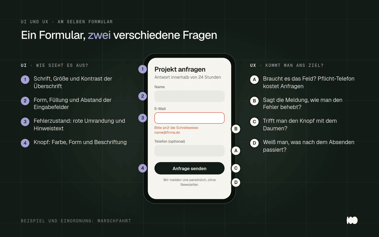
The same form, two perspectives: UI asks what it looks like; UX asks whether it helps you achieve your goal.
Where the term comes from, and what it implies today
The term “user experience” dates back to 1993 and, from the very beginning, had a broader meaning than just screen design. According to Jakob Nielsen of the Nielsen Norman Group, Don Norman coined the term that year for his department at Apple. In the later joint definition by Norman and Nielsen, user experience encompasses all aspects of a person’s interaction with a company, its services, and its products—not just a device’s user interface.
Norman and Nielsen explicitly distinguish the overall experience from the interface. Their joint definition on the Nielsen Norman Group website includes an example that we like to share: A movie review site may have a flawless search function, but the experience is still poor if the movie the user is looking for isn’t even in the database. Applied to a company website: Even the most beautifully designed services page is useless if it doesn’t answer the one question that brought the visitor there in the first place.
Usability is the measurable aspect of this. The ISO 9241-11 standard defines usability as the extent to which specific users, in a specific context, achieve their goals effectively, efficiently, and satisfactorily. Nielsen describes usability as a quality characteristic of the interface: whether it is easy to learn, quick to use, and pleasant. Therefore, for every page, first ask yourself what goal a visitor has there, and only then consider how it should look.
Beautiful is not the same as good: the four combinations
Honestly categorize your own website into one of four categories. A strong UI with a weak UX is the glossy dead end: big images, lots of movement, but you have to search for prices, processes, and contact information. A weak UI with a strong UX is the unassuming site that still reliably generates inquiries because the paths to information are short. If it’s weak in both areas, the only solution is a complete overhaul; the goal is to be strong in both.
The most dangerous combination is the first one, because it looks the best at the launch. We see this regularly with relaunches that are approved based on management’s preferences, not on what customers actually want. The site looks more sophisticated, yet inquiries still decline because the phone number is now hidden behind a menu or the form has gotten longer.
The second combination is the best starting point for a redesign. If an old page is generating inquiries, there’s something right about its navigation paths. In that case, it’s worth documenting and preserving those paths before the relaunch, rather than reinventing everything from scratch. For more on which mistakes cost the most inquiries, check out our article on the ten most common UX mistakes on corporate websites.
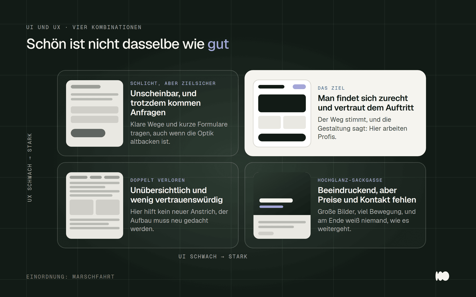
UI and UX can each be done well or poorly on their own. What's particularly dangerous is a visually appealing design without a clear path.
Five levels show where UI ends and UX begins
Think of a website from the bottom up, in five levels. The model was developed by Jesse James Garrett, who published it as a diagram in 2000 and elaborated on it in his 2002 book, *The Elements of User Experience*. At the very bottom is the strategy: what the organization wants to achieve and what visitors need. Above that are the scope—that is, what content and features are available—and the structure—that is, how users navigate from page to page and what happens after a click.
Only the top two levels are what most people call “design.” The framework determines where buttons, navigation, and text blocks are placed and how a form is structured. The interface determines colors, fonts, and images. Garrett classifies the framework as interface, navigation, and information design, and the interface as visual design. In our framework, this means: UI design primarily operates on these two levels, while UX design operates on all five.
Each level builds on the one below it. Garrett compares this to a house where you don’t build the roof until you know the shape of the foundation. This is exactly where many projects fail: color schemes are finalized before it’s even clear which features will get their own page. So, when you’re putting together the briefing, go through the levels from the bottom up and write down one sentence for each one. We’ve described what a good briefing looks like in our article “Why Most Web Projects Fail at the Briefing Stage.”
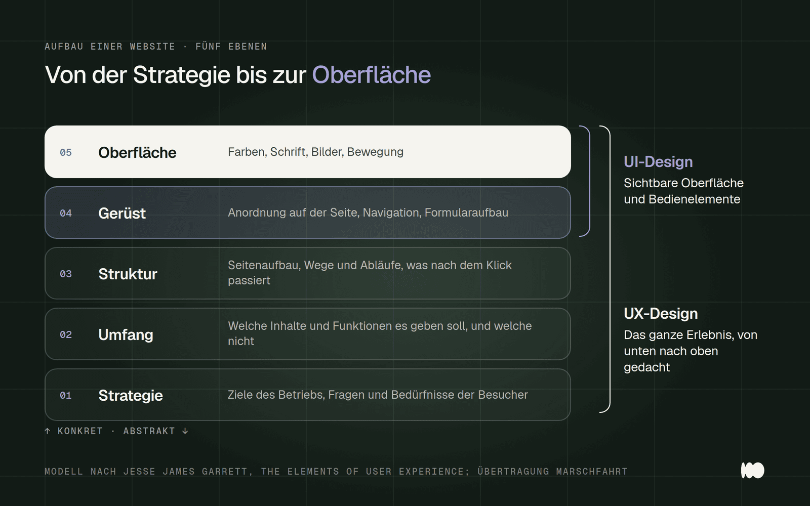
Garrett's five levels, applied to a company website. UI design is at the top; UX design ranges from strategy to the user interface.
Who Does What: Responsibilities and Outcomes of UX and UI Design
Don't ask for titles; ask for results that you'll ultimately have in your hands. The ISO 9241-210 standard lists typical deliverables for human-centered design: descriptions of user groups—such as personas, or profiles of typical customers—followed by requirements, rough and detailed prototypes, and user testing reports. These are UX deliverables. If you don’t receive them, you generally haven’t paid for any UX work.
UX design provides structure and evidence, while UI design provides the visual design and components. UX includes conversations with customers and the analysis of search queries, page structure, wireframes (i.e., black-and-white sketches without color), and clickable prototypes. UI design includes grids, typography, colors, icons, visual language, and the components themselves: buttons, fields, and cards. This also includes their states—for example, how a field looks when it contains an error, is disabled, or is currently selected.
Interaction design is the link between the two. The Interaction Design Foundation describes it as the design of how people interact with a product, with a focus on the moment of use. On a website, for example, this involves questions such as whether a menu opens upon the first tap or only after a second tap, and what the button does while the request is being sent. In small teams—including ours—the same people handle both tasks, and that’s fine as long as both sets of results are available in the end.

What UX and UI design each define and deliver. In small teams, the same people often work on both.
Where UX Is Really Decided on a Company Website
Follow the path of a query from search to response, step by step. It starts with the search results: Does the page live up to what the title and description promise? Then the homepage: Is it clear within five seconds what you do, for whom, and where? Anyone who finds only a slogan here will go back to Google and click on the next result.
It’s the content that determines whether someone will trust you. The process, price range, and real-world examples answer the three questions that almost every prospective customer has in mind: How does it work? How much does it cost, roughly? Have you done something like this before? The Nielsen Norman Group puts it succinctly: If a homepage doesn’t clearly state what a company offers and what visitors can do on the site, people will leave.
The process most often breaks down at the form and when it comes to the response. Required fields that no one can understand, a mandatory phone number field, no confirmation after submission, and days of radio silence: All of this is UX, even if it has little to do with design. We explain why forms are so often the bottleneck in our article “Why You’re Not Getting Any Inquiries Through Your Contact Form.” Try walking through the process yourself today—from the search results to the confirmation email.
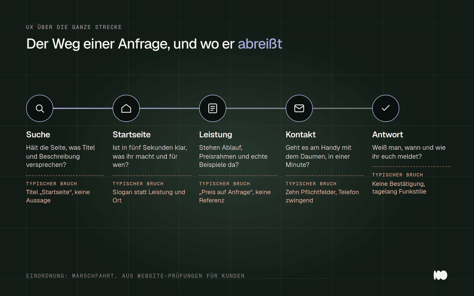
Five stages, five UX questions. These common pain points come from website audits we've conducted for clients.
Our own example: how we redesigned the contact form on marschfahrt.de
In October 2026, we did away with our own contact form—for UX reasons, not visual ones. Before that, we had a standard form: name, email, phone number, seven checkboxes for areas of interest, and a message field—all required fields. Visually, there wasn’t much to complain about. But anyone who just wanted to quickly ask if we could build a store still had to provide their phone number and write out a message.
The most significant changes involve the process. Now, questions are asked one after another, starting with the topic—multiple answers are possible. The follow-up questions are tailored to the selected topic; they differ for the online store compared to advertisements. Providing a phone number is optional, and anyone who stops in the middle can pick up where they left off on their next visit. Those who prefer to speak can go directly to the calendar with a single click.
We made the UI changes only after that. Instead of a list of boxes, there are tiles with icons and captions, and a progress bar shows how far along you are. To be honest, our first version was too playful and dark, with a grid and lighting effects. It didn’t fit with the rest of the site and seemed out of place, so we brought it back in line with the rest of the website’s design.
We don't have any reliable figures on the impact yet—the transition is still too recent. So, when you make the switch, be sure to track how many inquiries you receive each month beforehand; otherwise, you won't have anything to compare it to later.
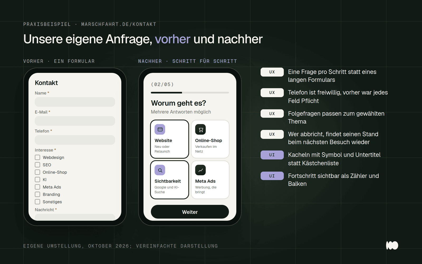
Our inquiry process before and after the transition. Most of the changes involve the workflow; only two relate to the design.
Two Projects Where UX Made All the Difference
At Pahl Energietechnik, the problem wasn’t the design—it was the lack of an answer to the customer’s first question. The old website provided only a superficial overview of the company’s services, and the outdated contact form mainly generated spam. Anyone interested in a solar system first wanted to know whether it would be a good investment for their roof. That’s why the site now features a solar configurator that shows the potential savings—including a cost overview—in just a few minutes, along with a detailed FAQ on incentive programs.
The flooring experts lacked a clear process. The company has been installing floors for over 30 years, but it remained unclear to potential new customers how the process worked and how quickly they could receive a quote. The new website is structured around three steps: consultation and quote, installation, and joint inspection—with each step explained individually. It also features customer testimonials ranging from architects to real estate agents. Both are UX decisions; the design simply made them visible.
Ask yourselves the same questions about your website that we ask ourselves for these projects. What is the first question a prospective customer might ask, and does the website answer it before they have to look for it? If the answer is a calculator, a process, or a price range, it belongs at the top of the page, not in the FAQ section at the bottom.
What the Numbers Reveal About Forms and Cash Registers
Count the fields in your form or checkout—that’s the fastest UX metric there is. The Baymard Institute, which has been testing checkout processes in online stores for years, concludes that an ideal checkout process can get by with 12 to 14 form elements—7 to 8 if you count only the input fields. By contrast, according to Baymard, the average checkout process in the U.S. has 23.48 elements, 14.88 of which are input fields.
Many cart abandonment cases stem from issues that can be resolved through design. Baymard cites an average documented cart abandonment rate of 70.22 percent, based on 50 studies as of September 2025. Among U.S. shoppers who did more than just browse, 18 percent said they abandoned their purchase because they were forced to create an account, and 17 percent cited a checkout process that was too long or complicated. Baymard notes that many of these issues can be resolved simply by making design changes.
Take these figures with a grain of salt. Baymard explicitly notes that the often-cited 35.26 percent increase in conversion rate resulting from an improved checkout process applies to large online stores, not to the website of a small business. The same applies to load times: A Deloitte study commissioned by Google found that a 0.1-second reduction in mobile load time resulted in an 8.4 percent increase in sales across 37 brands. The general trend holds true for small websites as well; you’ll need to measure the exact impact yourself—for example, using our free Design Check.
Testing Without a Lab: Five People Are Enough to Get Started
Have five people from your target audience complete a single task on your website and just watch. Jakob Nielsen explained as early as 2000 why small tests are the most effective: According to his model, a study with five participants identifies about 85 percent of usability issues. His recommendation is to conduct several small rounds rather than one large one, and to make improvements after each round.
The assignment must be specific; otherwise, you won’t learn anything. Don’t say, “Take a look at the website,” but rather, “Find out if the company operates in your town and request a quote.” Don’t say anything, don’t help, and don’t explain anything during the test. Write down every instance where someone hesitates, scrolls, goes back, or asks a question.
If you have very different customer groups, you’ll need separate test participants for each group. Nielsen recommends three to four per group—for example, separating individual customers from property management companies. For the first round, however, the most important group is sufficient. Supplement the test with four quick checks that you can do on your own: a five-second glance at the homepage, a thumb test on your cell phone, filling out the form yourself, and reading the confirmation email.
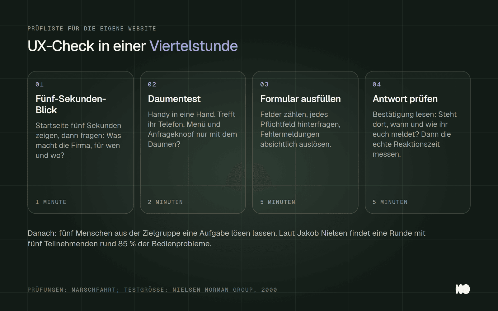
Four tests that don't require a lab. Together, they take about a quarter of an hour.
Accessibility is UX with a legal requirement
Check whether your online offering falls under the Accessibility Enhancement Act. The law has been in effect since June 28, 2025, and applies, among other things, to e-commerce services provided to consumers—such as online stores and online bookings intended to result in a contract. In this context, “accessible” means that people with disabilities can find, access, and use a service without undue difficulty and, in principle, without assistance from others.
Microenterprises that provide services are exempt. This refers to businesses with fewer than ten employees and an annual revenue or total assets of no more than two million euros. According to the Federal Agency for Accessibility, anyone who puts products into circulation is still subject to these requirements. Borderline cases, such as a simple request for a quote, are not explicitly clarified in official sources; you’ll need to have these reviewed on a case-by-case basis. Our article on accessible websites under the BFSG provides a detailed overview.
The new WCAG 2.2 guidelines read like a UX textbook. Version 2.2 of the Web Content Accessibility Guidelines has been a W3C recommendation since October 5, 2023, and introduces nine new success criteria. These include: clickable areas must have a minimum size or sufficient spacing; the focused element must not be obscured by fixed headers or cookie banners; “Help” and “Contact” links must be in the same location on every page; and data that has already been entered must not be requested again. Implementing these guidelines improves the website for all visitors, not just for people with disabilities.
How Much UX and UI Work Costs, and How to Order It
Don’t treat UX as an extra—make it an integral part of your budget, because it determines the success of the rest of your investment. We include it in every project: structure, wireframes, and testing are all part of a company website, which typically costs between 4,000 and 12,000 euros with us. Our page “How Much Does a Website Cost? ” with a cost calculator shows how these prices are broken down and what other providers charge.
Ask every agency the same five questions before hiring them. Will I receive wireframes or a site structure before we move on to colors and images? Who do you test the design with, and will I receive the results?
How do you test accessibility—such as contrast, keyboard navigation, and clickable areas? What happens after a form is submitted? And once the site goes live, how do we measure whether the new site is better than the old one?
Be wary of quotes that list only page counts and design iterations. This is a sign that you’re primarily paying for the visual design. That’s not a problem if your site’s structure already works and only the design is outdated. But if there’s no focus on user experience, a simple redesign alone is the most expensive mistake you can make. So make sure to get a written breakdown of which UX deliverables are included in the price.
UI/UX Designer as a Career: Responsibilities and Salary
Anyone who wants to understand the profession in more detail will find the most objective description at the Federal Employment Agency. According to BERUFENET, UX designers conceptualize apps, websites, and online services—among other things—to make them as user-friendly as possible in every respect. To do this, they use data from surveys, create user personas, simulate typical workflows such as placing orders, develop prototypes, and have users test them. There is no separate entry for UI designers on the site; a search leads to “interface design.”
There is only one official estimate for the salary. The Federal Employment Agency’s Salary Atlas classifies UX designers as specialists in graphic, communication, and photo design. According to the 2025 Salary Atlas, the median gross monthly salary for full-time UX designers is 4,149 euros nationwide and 4,162 euros in Cologne. Salary ranges cited in course provider blogs usually lack verifiable sources, so treat them with caution.
Figma is now the most widely used tool in both disciplines, at least in our day-to-day work. We haven’t found any reliable market share figures for it, so we won’t cite any numbers here. For businesses, it’s more important anyway that you ultimately have access to the designs. So make sure the contract guarantees you access to the design files.
Short Answers to the Most Frequently Asked Questions
What do UI and UX stand for? UI stands for "user interface." UX stands for "user experience." The "X" is a common abbreviation for "experience" in English.
Is usability the same as UX? No. Usability describes how effectively, efficiently, and satisfactorily someone achieves a goal, and is therefore a measurable aspect of UX. UX also encompasses expectations, emotions, and everything that happens before and after use.
What does a UX designer do, and what does a UI designer do? UX design identifies needs, structure, and workflows and validates them through testing. UI design shapes the visible interface and its components. Many job postings combine both roles into one position.
Does a small business website even need UX design? Yes, but only to a limited extent. A clear structure, a straightforward path to submitting an inquiry, and a test with five people cost very little and ensure that a new design doesn’t miss the mark on what customers actually need.
Conclusion: What you do today, this week, and in the future
Today, fill out your own contact form on your phone and count the fields and hovers. Cross out any required fields that you don’t really need for the initial response, and check whether it’s clear what happens next after you submit the form. This takes ten minutes and is the most effective UX measure there is.
This week, have five people from your target audience complete a task. Write down the task beforehand, observe silently, and note every obstacle they encounter. Then sort the obstacles into two columns: what is a problem with the workflow (UX) and what is a problem with the presentation (UI). Start with the first column.
Later, before the next relaunch, you’ll work your way through the five levels from the bottom up. Strategy, scope, and structure are established before colors are even discussed. And you’ll ask every agency what UX deliverables are included in their proposal. If you’d like help with this: That’s exactly how we work at Web Design for Businesses and Trades—with structure and testing before design.
What Has Changed and What That Means for You
September 22, 2025: The Baymard Institute has updated its overview of shopping cart abandonment rates; the average across 50 studies is 70.22 percent. For online stores, this means that requiring an account, hidden costs, and lengthy checkout processes remain the areas where changes can be made first.
June 28, 2025: The Accessibility Enhancement Act applies to e-commerce services provided to consumers. Anyone who sells or accepts bookings online—and is not a microenterprise—must now treat accessibility as a requirement, not an option. Existing contracts have transition periods extending through 2030.
October 5, 2023: WCAG 2.2 became a W3C recommendation. For website projects, this means that clickable areas, visible focus even when a cookie banner is displayed, and a help menu in a fixed position must now be included in every acceptance test.
Date of this version: October 5, 2026.
Would you like someone to review your website from a UX perspective?
If you want to know where the path to a request breaks down on your site, reach out to us via the contact form. We’ll take a look at your website and give you an honest assessment of whether a new design is needed or if a few changes to the process will suffice. We’ll respond within 24 hours, personally and without any sales pitch.
More Articles
© Marschfahrt Studio
Practical knowledge on web design, SEO, AI, and conversion optimization. Based on real projects, without any marketing spin.

