The 10 UX Mistakes That Will Cost Corporate Websites the Most Leads in 2026 (With Evidence)
According to the Web Almanac 2025, only 48 percent of mobile websites meet the Core Web Vitals standards, and that’s just the first of ten measurable issues. We’ll show you what each one costs, where the figure comes from, and the order in which you can fix them in a week.
Date
Category
Author

“We launched a new website last year, and it looks really good. But nobody’s calling anyway. Why is that?” The question came from the owner of a painting company in the Bergisches Land region. The answer was right there on her own cell phone: The homepage took a noticeably long time to load on the mobile network, the contact form had nine required fields, and the phone number could only be found in the legal notice.
Let’s start with the key takeaway, as of September 2026: Most lost leads aren’t due to design or budget, but to a few, measurable mistakes. Three of these are the most costly: a page that loads too slowly on a cell phone, a header that doesn’t explain within ten seconds what you’re offering and to whom, and a contact form with too many fields. The remaining seven also come at a cost, though less so, and some can be fixed in an hour.
For each mistake, we explain what happens, what the corresponding metric is, what a good solution looks like, and what we’ve observed among our clients. A candid note: The most reliable figures come from e-commerce, because every order is tracked there. These figures are only roughly applicable to service providers; we’ll indicate this in each case, as well as when referring to U.S. data. And if you’re hoping for more visitors: More inquiries rarely come from more traffic—they usually come from less friction.
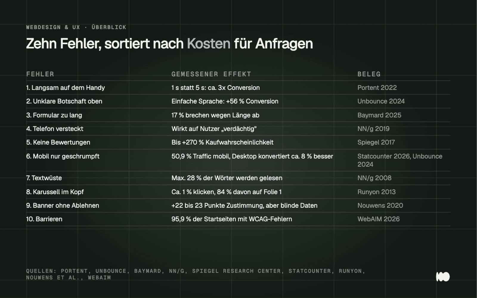
An overview of the ten mistakes, sorted by the cost of inquiries, with measured effectiveness and the strength of evidence for each source.
1. The page loads too slowly on a cell phone
What happens: The visitor comes from a Google search, sees a blank screen for a few seconds, and goes back to the search results. Often, they don't even show up in your statistics because the tracking code hadn't loaded yet.
Portent analyzed approximately 100 million page views across 20 websites (data from 2019, updated in 2022). According to the analysis, a B2B site that loads in one second generates about three times as many inquiries as one that loads in five seconds, and five times as many as one that loads in ten seconds. This is a correlation, not an experiment. The effect has been experimentally proven at Vodafone: a 31 percent improvement in LCP resulted in 8 percent more sales and 15 percent more leads per visit in an A/B test (web.dev, March 2021). In 2020, Deloitte and Google observed over a four-week period across European and U.S. brands that a 0.1-second reduction in mobile load time was associated with an 8.4 percent increase in purchases; this, too, is not a series of tests. The HTTP Archive’s Web Almanac 2025 illustrates just how widespread the problem is: Only 48 percent of mobile websites pass all three Core Web Vitals.
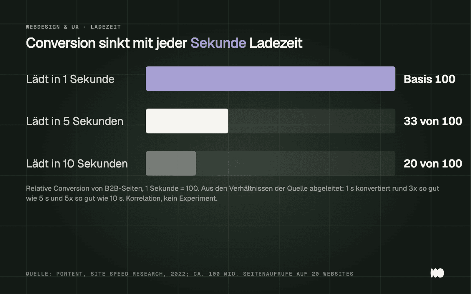
Conversion rates relative to page load times on B2B sites, according to Portent (2022): A one-second load time results in about three times as many conversions as a five-second load time, and about five times as many as a ten-second load time.
What looks good: compressed images in modern formats, no fonts from five different servers, and no video background in the header. At a restaurant in Cologne, the menu was a scanned PDF hidden behind the main button; on a cell phone, it just showed a loading circle. A streamlined HTML menu fixed the problem in a single afternoon.
2. The header doesn't say what you offer or who it's for
Here's what happens: At the top, it says "Welcome to Müller GmbH" above a stock photo, and after five seconds, the visitor still doesn't know whether you renovate bathrooms or service heating systems—or even if you operate in their city. They don't scroll; they leave.
In 2011, the Nielsen Norman Group used Microsoft data (205,873 pages) to show that users decide within the first ten seconds whether to stay. Unbounce’s 2024 Conversion Benchmark Report, which analyzed over 41,000 landing pages, shows how to make it through those first ten seconds: Pages written at a fifth- through seventh-grade reading level convert at a rate of 11.1 percent—that’s 56 percent higher than pages written at an eighth- and ninth-grade level. These are correlations, not tests on individual pages.
What looks good: A sentence that specifies the service, target audience, and region, followed by the next step. “Solar panels for single-family and two-family homes in the Kleve district, installed by our own technicians” beats any “Your energy, our passion.” For a solar company in the Lower Rhine region, this change was the only one made to the header; afterward, they received significantly more calls from homeowners in the surrounding area than from commercial customers.
3. The contact form has too many fields
Here's what happens: The visitor is convinced, clicks "Submit Inquiry," and is presented with fields for title, company, street, ZIP code, preferred date, budget, and a newsletter checkbox. All they wanted to know was whether you're available next week. They close the tab.
In June 2024, Baymard found that the average checkout had 11.3 form fields, whereas 8 would suffice—a reduction of 29 percent. The number of fields is more detrimental than the number of steps. In Baymard’s analysis of 50 studies (September 2025), the abandonment rate stood at 70.22 percent; 17 percent of those who abandoned the process cited a process that was too long or complicated, 18 percent cited the requirement to create an account, and 17 percent cited technical errors. These figures come from e-commerce and surveys and can only be applied to a contact form as a rough guide. The principle is the same: Every required field is a reason to put it off until later.
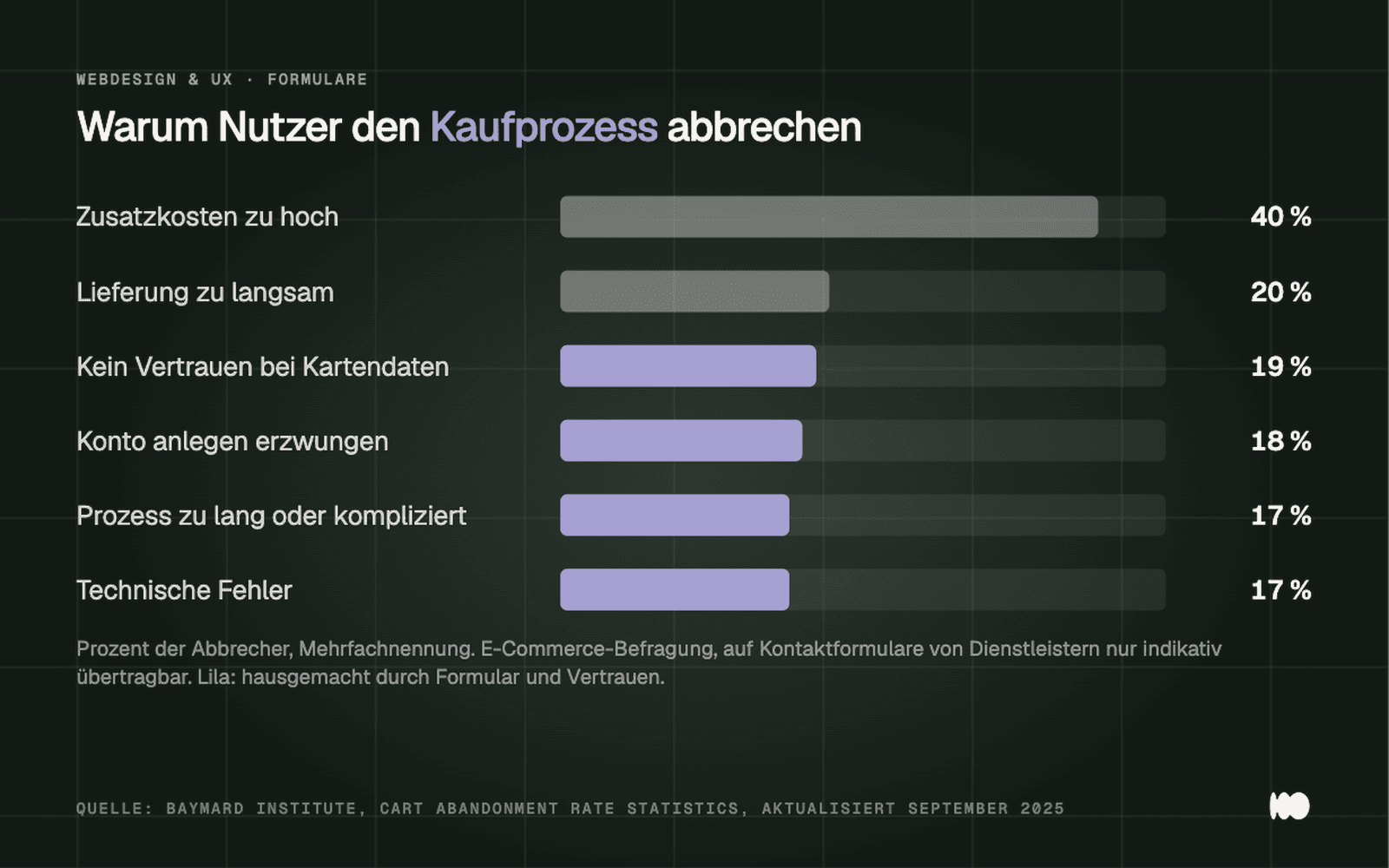
Why users abandon the checkout process, according to Baymard (September 2025): additional costs, lack of trust, mandatory account creation, overly long forms, and errors.
What works well: Name, one contact method of your choice, message. You can ask for any additional information during the callback. For an electronics company in the Rhineland, we reduced the number of fields from nine to three and had the confirmation email announce that we’d call back the next business day. The number of inquiries increased, and they became more useful at the same time, because no one was entering made-up values into required fields anymore. To find out why forms usually fail, check out our article “Why You’re Not Getting Any Inquiries Through Your Contact Form.”
4. The phone number is hidden
Here's what happens: A customer dealing with water damage or a toothache wants to call right now—not fill out a form. They look for the number in the header, then in the footer, and then tap the "Call" button for the nearest competitor on Google.
In August 2019, the Nielsen Norman Group tested 40 company websites with 20 working professionals. Participants expected the phone number, email address, and physical address to be clearly visible. Companies that hid their phone number came across as “suspicious” to them. Forms should complement direct contact, not replace it. This is a qualitative study, not a conversion measurement. However, it aligns with what every tradesperson knows: The job goes to whoever picks up the phone first.
What looks good: The number is displayed in the top right corner of every page—tappable on a cell phone—with the times when someone is actually available to answer right next to it. For a solar installer in the Münsterland region, the number was listed only on the contact page, buried three clicks deep, because the owner didn’t want to be “constantly disturbed.” After moving it to the header, the company started receiving calls that simply hadn’t been coming in before.
5. There are no reviews or trust signals
Here's what happens: The visitor doesn't know you. They see your services, but there's no indication that others have been satisfied with you—no gallery, no photos of people. They compare you to a competitor who displays their Google reviews and make their decision based on that.
In 2017, Northwestern University’s Spiegel Research Center used data from PowerReviews to show that visible reviews increase the likelihood of a purchase by up to 270 percent—by 190 percent for inexpensive products and by 380 percent for expensive ones. The effect is greatest for ratings between 4.0 and 4.7 stars—not 5.0—and it levels off after the first five reviews. This e-commerce data is from 2017 and is only indicative for service providers. The trend makes sense: the more expensive and less frequent the decision, the more weight others’ opinions carry.
What looks good: Five genuine reviews with names and locations right below the key message, the Google rating with stars and a count, the guild logo in the footer, and a real team photo. If you don’t have any reviews yet, ask your last ten satisfied customers personally.
6. The mobile view is a scaled-down version of the desktop page
What happens: Text overlaps, buttons are too small for a thumb, it takes three taps to get to the contact page, and a table scrolls sideways. The visitor struggles for ten seconds and gives up.
According to Statcounter, in August 2026, 50.89 percent of web traffic in Germany came from smartphones and 47.38 percent from desktops. In 2024, Unbounce reported that as much as 83 percent of visits were from mobile devices, while desktop conversions were about 8 percent higher. So the majority of visitors come from mobile devices, and that’s where conversions are lost more often. Anyone who checks their site only on an office computer is checking the minority.
What looks good: built first for mobile, then expanded to the desktop. Spaced-out buttons, one-tap contact, no tables. Our test for every release: the owner’s phone, using cellular data instead of Wi-Fi, and checking whether he can send a request himself in under a minute.
7. Wordy Prose and Technical Jargon
Here's what happens: The "Services" page is a block of text without a subheading, written in the language of the master craftsman's certificate. “We carry out energy-efficient building renovations in accordance with GEG” doesn't answer whether you can insulate the roof or how much it would cost approximately.
In 2008, the Nielsen Norman Group calculated, based on 45,237 page views, that users read at most 28 percent of the words on an average page. According to NN/g (2017, re-examined in August 2026), the F-pattern—in which users skim only the first few lines and the left margin—occurs primarily when text lacks headings and highlighting, including on mobile devices.
What looks good: one subheading per customer question, paragraphs with no more than four sentences, the most important sentence first, prices given as a range, and technical terms only where the customer uses them.
8. A carousel at the top of the page instead of a message
What happens: Five images change automatically, each with a different message. The visitor reads half of the first one, then it’s gone. The agency has thus resolved the dispute over which message should be featured at the top; the client doesn’t see any of them as quite right.
In 2013, Erik Runyon measured on the University of Notre Dame website that about 1 percent of visitors clicked on a carousel slide at all, and 84 percent of those clicks were on slide 1. A single website, though old, remains the most-cited study to this day. The Nielsen Norman Group found through eye-tracking that animated, ad-like elements are viewed in only 27 percent of cases; their recommendation (2013, re-evaluated in August 2026): no more than five slides, no automatic switching on mobile devices, and preferably no carousel at all.
What looks good: an image, a sentence, a button. For a dental practice in southern Cologne, we replaced five slides with a photo of the reception area, a sentence describing their core service, and a button for scheduling appointments. No one missed the slides, and the page loaded noticeably faster.
9. Pop-ups and cookie banners without a "Decline" button
What happens: When the page is first loaded, a newsletter window appears over the page, with a cookie banner underneath that simply displays “Accept All” in large letters. On a cell phone, none of the content is visible.
Google states in the Search Central documentation (as of December 2025) that intrusive interstitials and dialog boxes can lead to poorer search performance; cookie banners are exempt, but newsletter windows are not. The study by Nouwens and colleagues (CHI 2020) shows that only 11.8 percent of 680 British consent banners met the minimum requirements of the GDPR, and in an experiment with 40 participants, removing the “decline” button from the first level increased consent rates by 22 to 23 percentage points. This is why many banners are designed this way, and according to Nouwens, it is precisely this design that fails to meet the GDPR’s minimum requirements.
What looks good: “Reject” and “Accept” buttons of equal size on the first level, with no additional window popping up in the first few seconds. Your analytics will then no longer track a portion of your visitors; that’s better than numbers generated by a manipulative banner.
10. Barriers that hinder users—and, starting in 2025, are also prohibited by law
What happens: Gray text on a light gray background, unlabeled form fields, buttons without text. People with poor vision, those reading on their cell phones in the sun, or those navigating with a keyboard won't be able to complete the request.
The WebAIM Million study from February 2026 automatically tested the homepages of the one million most-visited websites: 95.9 percent violate WCAG 2, with an average of 56.1 errors per page. Insufficient contrast was found on 83.9 percent of the pages, missing alternative text on 53.1 percent, and unlabeled form fields on 51 percent. Automated tests detect only a fraction of the problems; the actual rate is higher. Furthermore, the Accessibility Enhancement Act has been in effect since June 28, 2025, for online stores, bookings, and contract conclusions. Micro-enterprises with fewer than ten employees and a maximum turnover of two million euros are exempt when providing services; fines can reach up to 100,000 euros. Read more in the article on accessible websites under the BFSG.
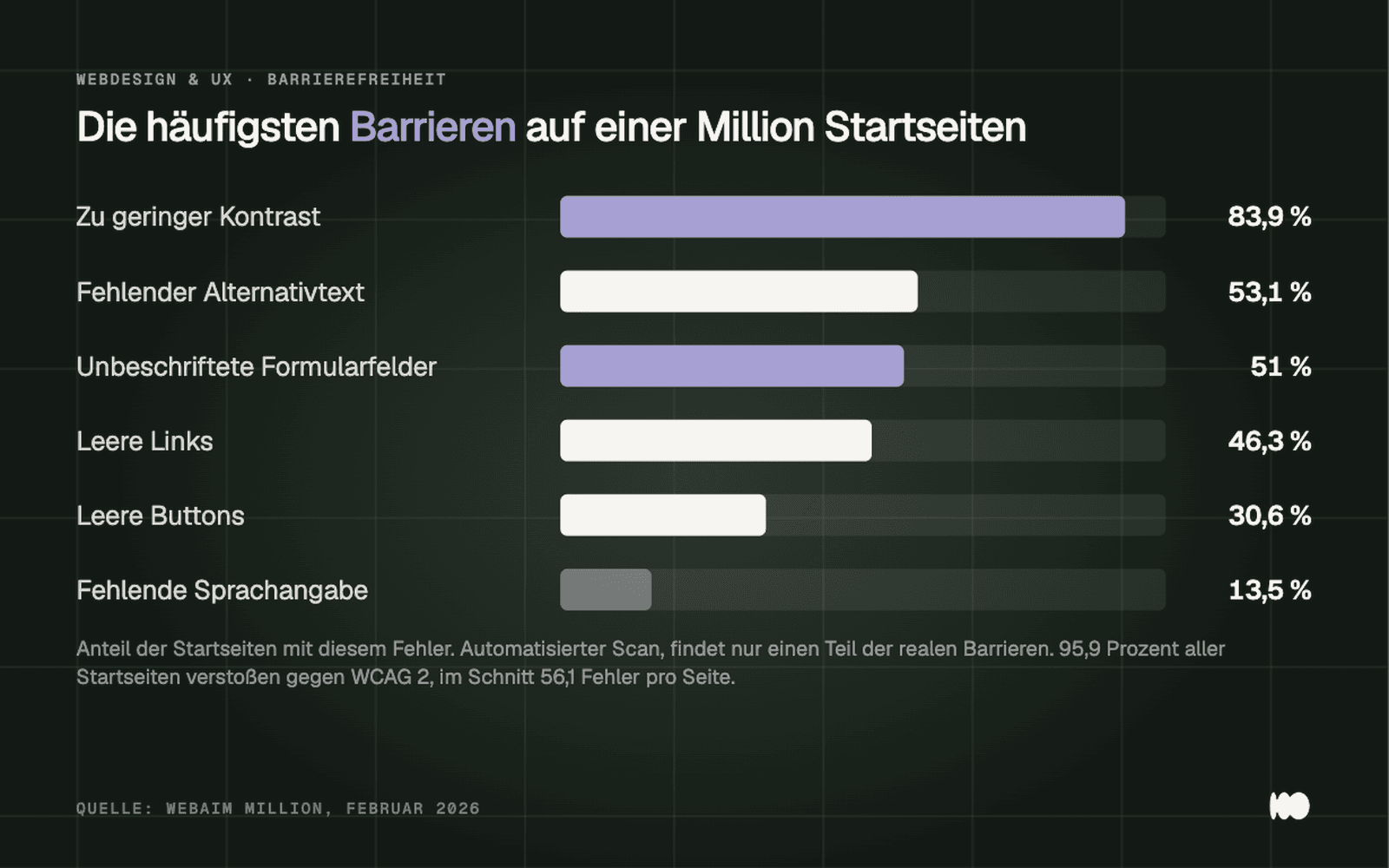
The most common barriers on one million homepages, according to WebAIM Million (February 2026): Contrast issues and unlabeled forms affect more than half of all pages.
What looks good: Check for contrast, label every form field, provide text for every button and link, and add a description to every image. An unlabeled form field not only leads to fewer inquiries but is also legally vulnerable; that’s why it belongs on this list.
Conclusion: The schedule for a week's work
Monday: Measure the loading time on a cell phone and remove the largest images, fonts, and scripts; this is the most effective approach, backed by solid evidence. Tuesday: Reduce the form to three fields. Wednesday: Add a clickable phone number to the header, including availability. Thursday: Replace the carousel with a sentence that specifies performance, target audience, and region. Friday: Add an equally prominent “Decline” button to the cookie banner and remove the newsletter pop-up.
Evaluations, text structure, contrasts, and labels will be covered in the second week. If you don't have time for that, check out the "Web Design" section to see how we build websites where these ten points are taken care of from the start.
Related: What Features Does a Successful Company Website Need? And Storytelling in Web Design Isn't a Gimmick—It's Structure
Want to know which of these ten mistakes your site is currently making?
Send us the link. We’ll check the ten points on a cell phone connected to a cellular network and let you know what you can fix on your own and what you can’t. Send us a quick message using the contact form. We’ll respond within 24 hours—personally and without any sales pitch.
More Articles
© Marschfahrt Studio
Practical knowledge on web design, SEO, AI, and conversion optimization. Based on real projects, without any marketing spin.