Creating a Landing Page: Structure, Examples, and the UX Mistakes That Cost You Leads
How to Build a Landing Page That Generates Leads: Eight Building Blocks Illustrated with a Real-World Example, Reliable Data from UX Research, Templates You Can Use, and a Checklist to Get You Started.
Date
Category
Author

A landing page has exactly one job: to turn a visitor into an inquiry, a purchase, or an appointment. No distracting navigation. No “About Us” section with three paragraphs of company history. Just one offer and one button. It sounds simple, and yet most landing pages we see in initial consultations fail in the same ways: a headline that doesn’t promise anything, a form with twelve fields, and a price you only find out after making a phone call.
This post breaks down, step by step, how to build a landing page that generates leads. As an example, we’ll use our own “999 Euro” website page, complete with screenshots and annotations. We’ll also include reliable data from UX research, templates you can use, and a checklist to get you started.
In a nutshell (as of October 9, 2026)
A good landing page answers the questions a customer asks in a specific order: What do I get? Is this right for me? How much does it cost? How does it work? Can I trust you? What about my concerns? And where do I click now? In addition, there are three technical rules: simple language, a short form, and a page that loads on a cell phone in under 2.5 seconds. According to the largest study on the subject, landing pages convert an average of 6.6 percent of their visitors.
Landing Page or Home Page: The Difference
A homepage showcases everything you do, while a landing page sells just one thing. People who already know you or have been referred to you browse your homepage. People who land on a landing page do so with a specific intention—usually via an ad, a search, or a link in an email. They want to know within seconds whether they’ve come to the right place. You can also find a brief definition in our glossary under “landing page.”
You need a landing page as soon as you’re driving traffic or specifically attracting visitors for a single offer. Typical examples include: a Google or Meta ad for a service, a fixed-price package, a seasonal promotion like “Heating System Check Before Winter,” a job posting, or an event date. Anyone who places an ad on the homepage pays for clicks from visitors who first need to find their way around there.
The Assembly, Piece by Piece
The order follows the questions on your customers' minds, not your organizational chart. Our 999-euro page has eight sections, and each one answers exactly one question. Let's go through them one by one.
1. The Promise: What Do I Get?
The headline should describe the offer, not your attitude. “We love good design” doesn’t say anything. “Your website for 999 euros. Ready in 48 hours, including copy and a contact form” states the price, turnaround time, and scope in a single sentence (1). Directly below that are two buttons: one for making a decision (2) and one for anyone who still has a question (3). The three checkmarks below address the most common concerns before they even arise (4).
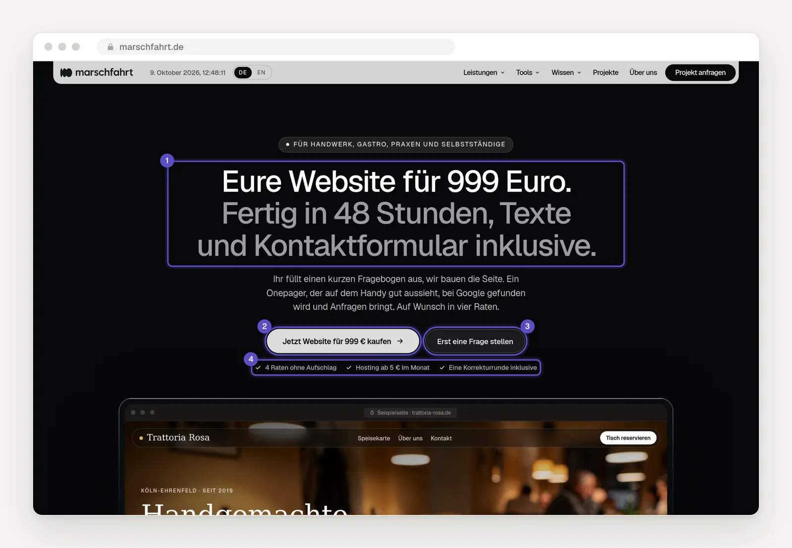
The first screen of our landing page: Value proposition (1), main button (2), secondary button (3), and three pain points addressed (4).
Label the button with what happens when you click it. “Start Now” or “Learn More” are convenient, but unclear. The Nielsen Norman Group had eight people figure out what a delivery service offers; six of them clicked “Get Started” and ended up in the middle of the ordering process instead of on the information page. Better options: “Request a callback,” “Request a quote for roof renovation,” “Buy the website now for €999.”
Offer those who are hesitant a second, easier option. Not everyone is ready to buy after ten seconds. A second button, such as “Ask a question first,” captures exactly those visitors who would otherwise just leave. Important: The main button should be much more prominent so it’s clear what the next expected step is. This template will help you draft your headline:
2. Who is this for: Is this for me?
Explicitly state who the offer is not intended for. At first glance, this may seem bold, but it builds trust. Anyone who reads “Not for: Online stores with shopping carts, companies with multiple locations” is also more likely to believe the “It’s designed for” section. And you’ll save yourself the trouble of dealing with inquiries that aren’t a good fit anyway.
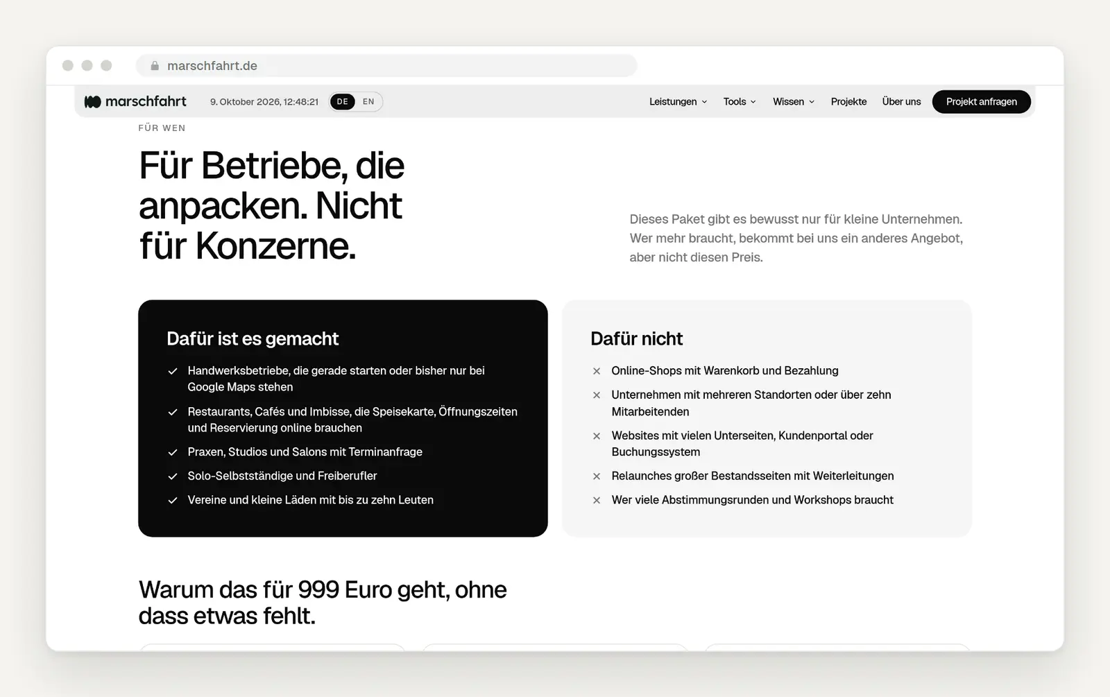
Two columns: who the package is for and who it isn't for. Below that, three reasons why the price works.
3. Numbers Instead of Adjectives
Replace every “fast,” “affordable,” and “flexible” with a number. A one-time fee of 999 euros, 48 hours until launch, 4 installments with no extra charge, 5 euros a month for hosting. Four numbers, and the most important questions are answered before anyone even has to ask. Numbers can be verified; adjectives cannot—that’s the whole difference.
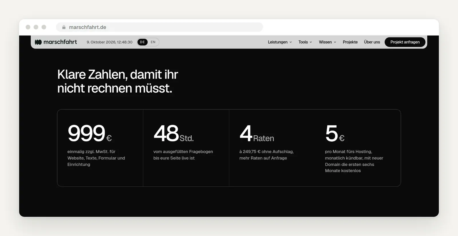
Four numbers, each with a short explanatory sentence below it.
4. The Process: What Happens After You Click?
Take away the fear of the unknown by showing the steps involved. Many people hesitate not because of the price, but because they don’t know what to expect after they click. Four numbered steps with time estimates—in our case, from “Buy a package, 5 minutes” to “Go live”—make the process tangible.
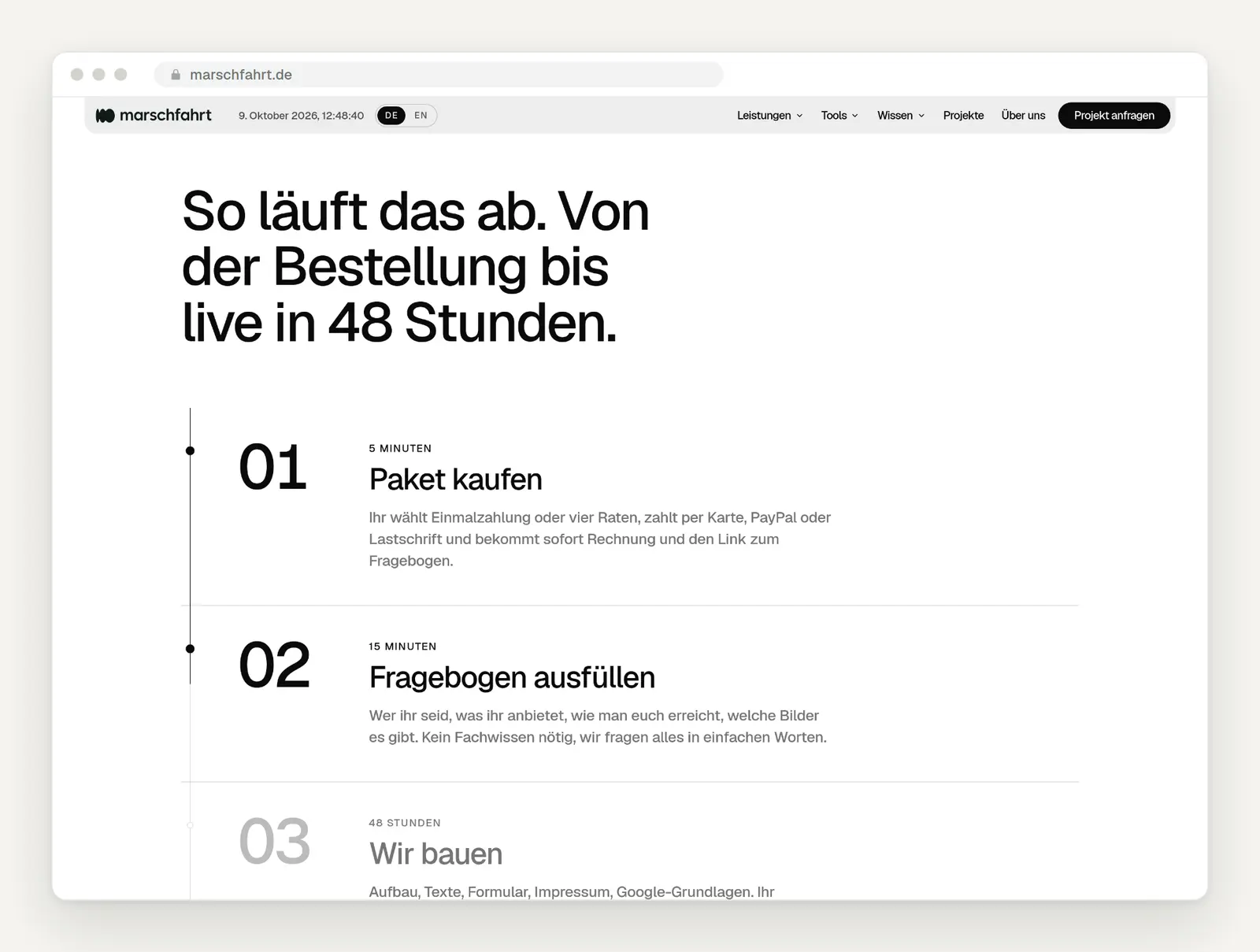
The procedure in numbered steps, each with a time indication.
5. The Offer: What's Included, and How Much Does It Cost?
List the price, including everything that’s included. On the left, we list everything that’s included in the package (1); on the right, the price including sales tax, the payment methods, and the “Buy Now” button (2). We even include the ongoing hosting costs. “Price upon request” is almost always a reason for visitors to leave a landing page, because it requires them to take extra steps before they can find out anything.
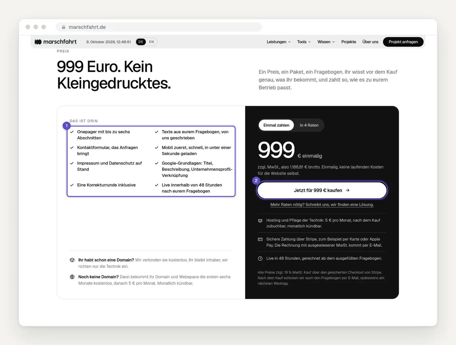
Scope of services on the left (1), price, payment methods, and the "Buy" button on the right (2).
If you don’t have a fixed price, give a price range. In tests conducted by the Nielsen Norman Group with moving and cleaning companies, providers that didn’t list a price were almost immediately ruled out. One participant said of a cleaning service that didn’t list a price that she felt the company wasn’t “open enough.” The researchers strongly recommend giving a price range rather than nothing at all: “Starting at 1,500 euros; most projects fall between 2,000 and 4,000 euros” is more honest than “price upon request.” Our website cost calculator shows you how to estimate prices for websites.
6. Proof: Can I trust you?
Show real testimonials with names and job titles. According to the Nielsen Norman Group, trust on the web is built on four factors: design quality, clearly stated prices and terms, comprehensive and up-to-date content, and links to the rest of the web—such as genuine reviews. Anonymous quotes like “Great service! – M. from K.” have the opposite effect.

Customer testimonials, including name, title, and company.
7. Objections: What about my concerns?
Write down the questions you hear over and over again on the phone. “What’s the catch?”, “What if I don’t have any text?”, “Do I own the website?” Every question answered on the page is one less hurdle before a customer makes an inquiry. Phrase the questions the way customers would ask them, not the way you’d like to hear them.
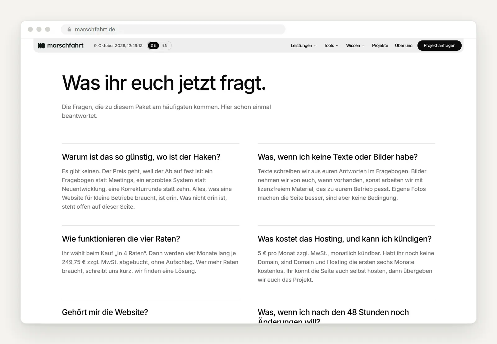
The most frequently asked questions, phrased in customer terms and answered briefly.
8. The Conclusion: Once Again, a Clear Path
Repeat the button at the end—anyone who scrolls this far is interested. At the very end, we include the “Buy” button again, along with a note that we’ll respond personally within 24 hours, and our direct email and phone number. People who have read all the way to the end are often just looking for that final confirmation.
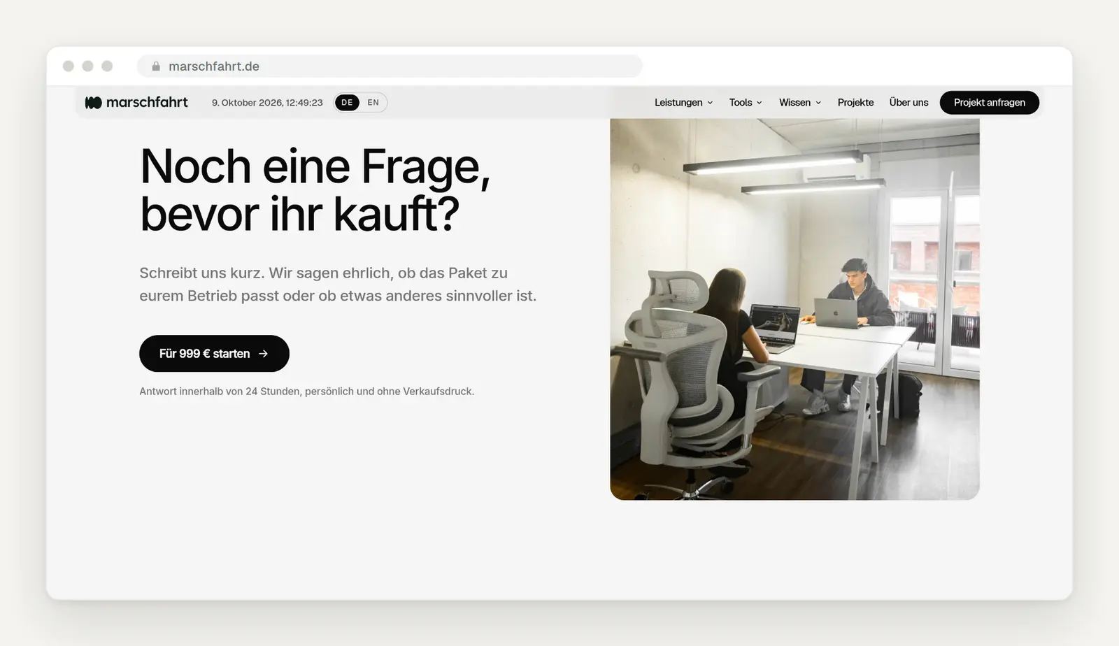
Closing with a call to action, a promise to respond, and direct contact information.
Above the fold: What's Really True About the First Screen
The first screen is the most important, but people scroll. In 2018, the Nielsen Norman Group conducted an eye-tracking study with 120 participants: 57 percent of viewing time was spent in the area above the fold, and 74 percent in the first two screen heights. In 2010, the first figure was still 80 percent. What this means for you: The call to action and the main button should be at the top; everything else can and should be placed further down. A landing page doesn’t have to fit on a single screen.
Mobile-first: About half comes from cell phones
First, test your landing page on a cell phone, not on a large screen. According to StatCounter, about half of all page views in Germany come from smartphones—an average of 46 percent over the last twelve months. For ads on social media, that percentage is usually significantly higher. On a cell phone, the first screen must work just as well: the headline must be legible, and the main button must be within thumb’s reach.
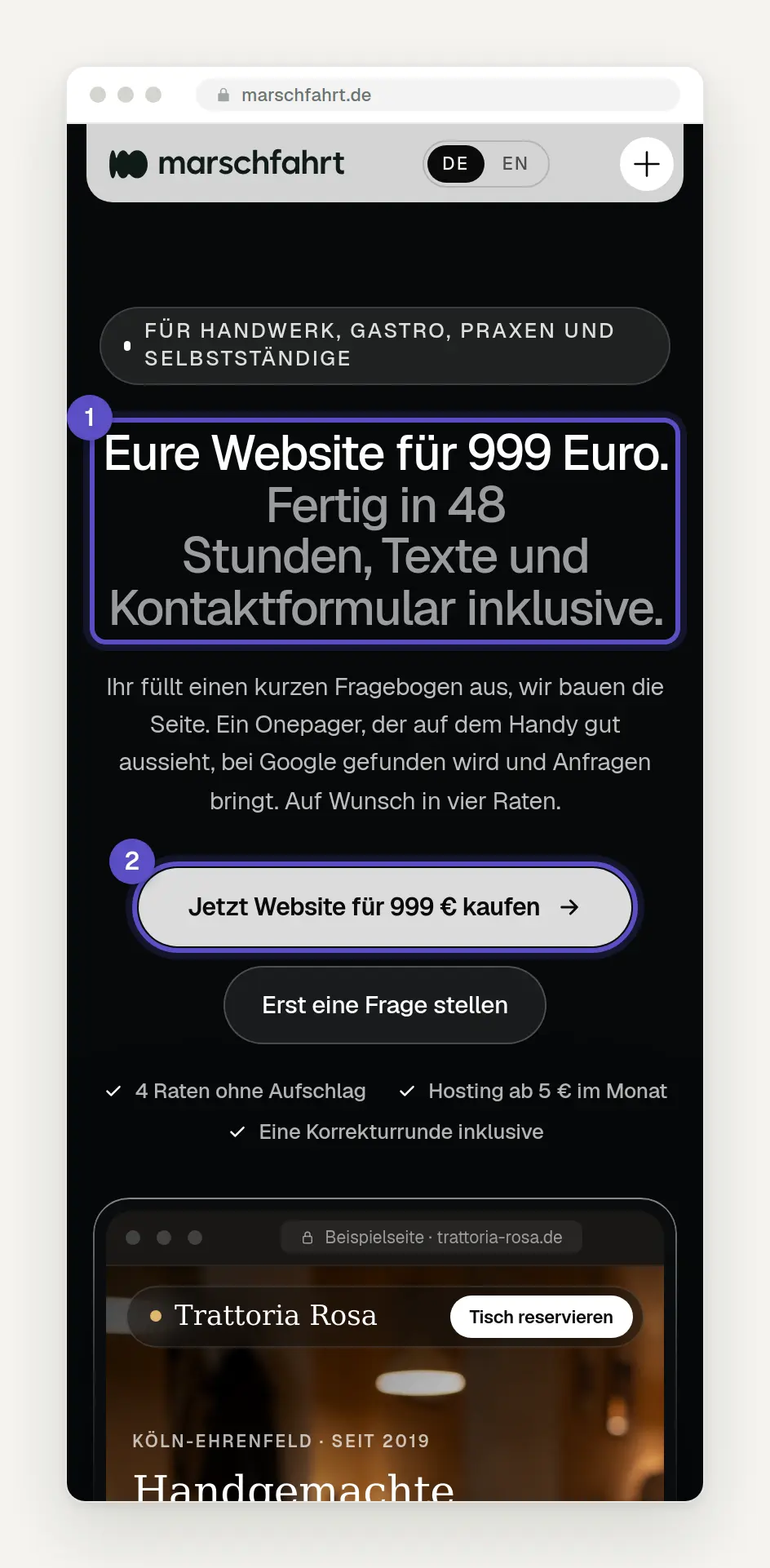
The same page on a smartphone with a width of 390 pixels: "Promise" (1) and the "Main" button (2) appear on the first screen.
The form: this is where the request is processed
Every field you don’t need costs you inquiries. A laboratory study cited by the Nielsen Norman Group clearly illustrates the difference: Forms that follow standard usability guidelines were submitted without errors on the first attempt in 78 percent of cases, while forms that violate these guidelines were submitted without errors in only 42 percent of cases. The Baymard Institute counts an average of 11.3 form fields in online stores, even though 8 would suffice. For a contact form, three to five fields are usually sufficient: name, email or phone number, and a free-text field.
Indicates required and optional fields. Baymard has observed that when only the optional fields are marked, 32 percent of test participants receive an error message because they assume everything else is optional. Displays errors directly in the field as the user types, rather than waiting until after submission. According to Baymard, about one-third of online stores still do not provide this immediate feedback.
You generally do not need a consent checkbox for an inquiry. Anyone who requests a quote via a form is providing you with their data to initiate a contract; the legal basis in this case is Article 6(1)(b) of the GDPR. However, you are required to include a link to your privacy policy on the form in accordance with Article 13, ensure encrypted transmission, and practice data minimization: only collect the information you truly need to respond. This is not legal advice; if in doubt, have your privacy policy reviewed. To learn why forms often fail in other ways, read our article “Why You’re Not Getting Any Inquiries Through Your Contact Form.”
The text: Simple language is more effective at converting
Write in a way that a 12-year-old can understand. For its 2024 Conversion Benchmark Report, Unbounce analyzed over 41,000 landing pages with 57 million conversions. Pages written in simple language—roughly at the fifth- through seventh-grade level—converted an average of 11.1 percent of visitors. Pages written in technical jargon converted 5.3 percent. This is a correlation, not proof, but it’s a clear one.
Put your own numbers into perspective. According to Unbounce, the average conversion rate across all industries was 6.6 percent, and 6.1 percent for service providers. These are median values—half of the websites are above this figure, and half are below it. If your website’s conversion rate is at 1 percent, it’s almost always worth working on your copy and forms. Incidentally, there are no reliable comparative figures specifically for German trades businesses, even though some providers claim otherwise.
Load time: the threshold is 2.5 seconds
Follow Google’s Core Web Vitals guidelines. The largest visible content should load within 2.5 seconds at most, the page should respond to user input within 200 milliseconds, and the page should not jump while loading. These metrics are measured using real visitors, and the value achieved by the 75th percentile is what counts. According to the Web Almanac 2025, only 48 percent of mobile pages meet all three metrics. You can check how fast your page is for free with our Speed Check.
Be careful with the well-known statistic that 53 percent of users bounce after three seconds. It comes from Google data from March 2016 and is still cited today without a year specified. The general trend is correct, but the figure is ten years old. By the way, anyone who runs Google ads can also see the quality of their landing page reflected in the Quality Score: one of its three components is called “User Experience with the Landing Page.” According to Google, this is a suggestion for improvement, not a direct factor in the ad auction.
Accessibility: When the BFSG Applies
A page that is purely informational is generally not subject to the Accessibility Enhancement Act. This is stated by the Federal Accessibility Agency in its guidance on the law. The situation is different if a contract is concluded through the page, such as when booking an appointment online or making a purchase. Micro-enterprises with fewer than ten employees and a maximum turnover of two million euros are exempt when providing services. Whether a “Request a Quote” form falls under this exemption has not been conclusively clarified. Read more about this in our article on accessible websites under the BFSG. Regardless of the law, the following applies: Good contrast, large buttons, and clear language help all visitors.
Testing: Five people are enough to get started
Show your landing page to five people who aren’t familiar with it before you spend money on ads. According to the Nielsen Norman Group, five test subjects can identify about 85 percent of a page’s usability issues. You don’t need a lab to do this: sit next to someone from your target audience, give them a task, and watch without helping. These tasks have proven effective for us:
Have an AI run through it as well, acting as a critical customer. It doesn't replace a real test, but it can spot the obvious gaps in a minute. Just copy the text from your page and paste it in here:
The Pre-Flight Checklist
Go through these points before your first ad goes live. If you can answer “yes” to all of them, you have a landing page that’s better than most of the ones we see:
Build it yourself or have it built?
Building it yourself is worth it if you want to quickly test a single action. With website builders like Framer, Webflow, or Wix, you can have a simple landing page up and running in an afternoon, and with AI tools, it goes even faster. To find out just how far you can go with this, check out our article “Creating a Website with AI: When It’s Enough.” The building blocks from this article apply regardless of the tool you use.
It’s worth having a website built if you have an advertising budget or plan to keep the site running for a long time. In that case, every improvement in the conversion rate directly benefits your advertising budget. For small businesses that need a streamlined site with a contact form, we’ve built a website specifically for that purpose for 999 euros —the example featured in this post. For anything larger, we offer our web design services.
Date of this version: October 9, 2026. All studies are cited with the year; we have verified the figures against the original sources.
Do you want a landing page that generates leads?
We build landing pages for businesses that want to attract customers through ads, promotions, or a clear offer—from the copy to the form—that really resonate. Related: The 10 UX Mistakes That Cost Websites Leads · Service: Web Design
Let us know what you have in mind by filling out our contact form. We'll respond within 24 hours—personally and without any sales pitch.
More Articles
© Marschfahrt Studio
Practical knowledge on web design, SEO, AI, and conversion optimization. Based on real projects, without any marketing spin.

